I thought you might like to see the process I take to go from paper to print. In this series, I’m going to show you how I consolidate my ideas and turn my drawings into a printed textile.
Every time I start a new pattern, I tend to go through a different process. I think it’s best to go with whatever feels right in the moment, so it will be interesting to document the steps as I create a new design.
I’ve been mulling over loads of ideas for patterns. The seasons are changing, late summer blooms are fading and the goldenrods are coming into full color. I’m seeing different textures in the garden and the angle of the sunset is changing and affecting what I see. Everything glows peach for a moment before dusk falls. I love noticing these changes.

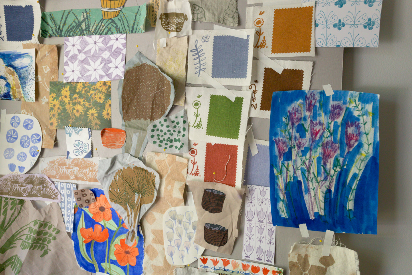
This morning I wandered around the studio grabbing scraps of fabric, color swatches, past prints and sketches that had the feeling I’m after in these new prints.
I pinned all these up on a board so I could stand back and see what I could make of this collage.
 Hand-drawn tile patterns, bold colors like oranges and blues, lots of green. Baskets from the harvest. Swooping birds in a dark sky, natural dyes, warm neutral colors, positive and negative space, monochromatic color schemes, patches of blooming grasses, tall swaying sticky pointy stems.


There’s a printed fabric swatch I made awhile back that got put on the back burner. I found it recently while sorting through fabric scraps.

I can see this design on a blouse, in a warm neutral, accompanying a dark navy linen skirt or pant. I like the texture of the hand-drawn fill- it almost reminds me of fur.
When I think of making a new print, my mind instantly goes to seeing that print in context. What I love about printing on fabric is the utility of it all. Imagining a pattern on clothing, or in a home context brings a certain life to that drawing and makes it not only useful, but beautiful.
Back to looking at my board, I notice I pinned quite a few patterns that are made from smaller motifs. There’s also quite a few tile patterns.

For colors, I’m really liking the warm neutrals and rich complementary colors.
Now I go back to the drawing table. I’m going to make some more sketches after analyzing my inspiration board. I try to do this very freely. No looking at the computer, no looking at Pinterest or Instagram, just taking in what I’ve thought about and trying to get those feelings and imagery on paper.
Linda C Greiss on Sep 15, 2019
Great post! Always fun to learn about fellow artists creative thought process.